
WEB Projects
⋆ UX DESIGN ⋆ ACCESSIBILITY ⋆ RESPONSIVE IMPLEMENTATION ⋆


.webp)


Ink & Spirit: Tattoo Studio Template
A custom template designed for tattoo studios that want a modern online presence without the usual cliché dark-and-edgy overkill.
Most tattoo sites lean hard into the dark, gritty aesthetic. This template balances edge with accessibility - moody enough to feel authentic, clean enough that potential clients actually want to browse it. Traditional flash elements give a nod to tattoo culture without making the whole thing feel
The booking form sits right on the homepage because that's what most visitors are there for. No reason to make them hunt for it or click through to a separate page.
Built on Wix Studio so studio owners can update it themselves - swap photos, adjust copy, launch without paying a developer every time something changes. Fully responsive because people book appointments from everywhere these days.


Pau Hana Surf Supply: Web Design
Designed both the US and NZ sites with two priorities: work flawlessly on every device, and make product information actually easy to find.
Responsiveness wasn't just about making things stack on mobile - it was about making sure someone scrolling on their phone at the beach can find specs, compare boards, and check out without squinting or zooming. The layout adapts without losing hierarchy or clarity.
The bigger challenge was the product pages. Paddleboards have a lot of technical info - dimensions, weight capacity, materials, what's included - and most sites either bury it in tabs or dump it all at once. I restructured the information architecture so the most important details hit first, then secondary specs are organized in a scannable format. No hunting, no guessing.
The result: customers can quickly figure out if a board fits their needs without scrolling through paragraphs or opening a PDF. Clear messaging, efficient layout, and a smooth experience whether they're shopping from a laptop or their phone on a dock somewhere.


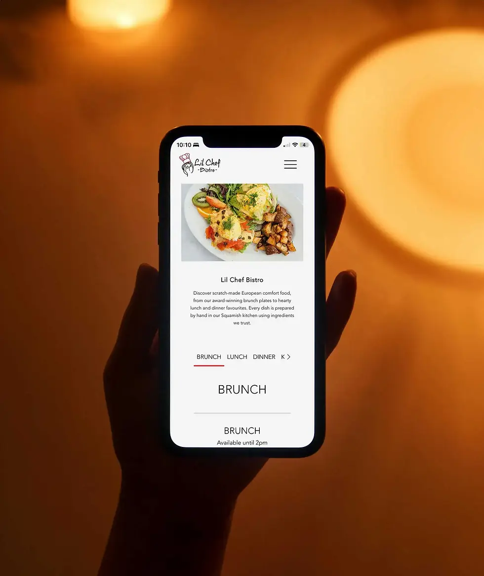
Lil Chef Bistro: Web Design
I worked at Lil Chef as a server and cook, so I knew exactly what the site needed to communicate: warm, welcoming, and the kind of place where the food is as comforting as the atmosphere.
The design leans into that cozy bistro feeling - approachable, not pretentious. The goal was to make people hungry and make them want to stop by, not impress them with flashy effects or overly stylized layouts.
Everything people actually need is right on the homepage: location, hours, and how to get in touch. No digging through pages to find out if they're open on Mondays or where to park. Simple, straightforward, and respectful of people's time.
Navigation is intentionally minimal. A small restaurant doesn't need a complicated menu structure - just a clear path to the menu, hours, and contact info. Fewer clicks, less confusion, more customers walking through the doors.
Fully responsive because people look up restaurants on their phones while they're already hungry and deciding where to eat. If the site doesn't load fast and look good on mobile, they're picking somewhere else.

© 2024 by Site Zed.